TD Bank
Redesigning a better banking for
TD mobile application

With the TD Bank app in Canada user can deposit checks, pay bills, transfer money between your accounts, send money to friends, view account activity and more—all from Apple® or Android™ smartphone or tablet. This application are redesigned for newcomer and new user easy to use, more friendlier, and trustworthy.
My Role
User Research
User Interviews
User Flows
Sketching
Wireframing
Design System
Interaction Design
Understanding the Problem
I interviewed and analyzed users of different age groups and discovered all of them who are international student and new comer live in Toronto struggled when first time to use TD application, they confusing how to use the app and sometime take time when they start to send money to someone
Problem Statement
How might we redesign the TD Bank App to be easier to use and more user-friendly for newcomers and new users?

User Research Process
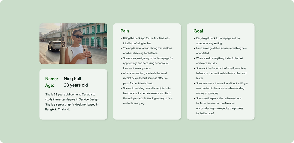
I interviewed and analyzed users of different age groups and discovered all of them who are international student and new comer live in Toronto struggled when first time to use TD application, they confusing how to use the app and sometime take time when they start the step to send money to someone. Moreover, when the money sent sometime it’s take long time to prove their money was sent or not. From this analysis, I made 1 user personas and defined their experiences in maintaining their mobile banking in Canada with user flows.

Explore the Solution
The interview shed light on user pain points and potential solutions, resulting in a comprehensive list of features that can enhance the app's user experience. After completing the interview process, I got a list of features which the users want
in their app.
Design Feature Sets
-
Quick Banking anytime, anywhere
-
Mobile check deposit
-
Mobile bill pay options
-
Check account balance
-
Manage all products and services
-
Manage favourite contact
-
Share or Save the transection
Create User Flow
I worked on the user flows for easy navigation by the user and satisfactory user engagement.

Create The Low-fi Wireframe
With the TD Bank app in Canada user can deposit checks, pay bills, transfer money between your accounts, send money to friends,

After Testing
Before designing the final prototype, I conducted Usability Testing by sharing the prototype link with the users and asked them to use the app and explore the various features in my vicinity, which in turn would help me figure out what exactly are the problems faced by the users.
The Problems and Solutions are mentioned in the table below:
Problem
-
When user want to see the total of balance it does not easy to see it quickly.
-
User want to go to move money button in the navigation bar they confuse the first time because too much of button.
-
User don’t want to use QR code to verify slip because make they do more task that useless.
-
User want to add favourite contact all the time they want because sometime they forgot to add the contact to their bank account. Since it have function send money to who ever they want without add contact.
Solution
-
I changed layout of this section to display the balance of the main account and total of the balance of all of bank account. User can slide left and right to switch another account easier.
-
I explore the solution and select the most important function and the most usage of what user need to use the bank application in 3 pages easy to link to Homepage, Online Banking, and setting page.
-
I remove the QR code in success transection page.
-
After transection success they will receive the success transection page.
I add the button “add favourite contact in this page.
Design System
When it came to Color Palette, I wanted to choose those colors which signify the importance of the brand colors with green of TD bank. I also create the icon set have rounded corner it give feel friendlier and cleanliness easy to catch up.

Final Design

As The Result
In a field trial with around 5 users, I found that new design helped users to be encouraged easier to follow the step for banking. Firstly, the information when they enter the homepage more clear and users can see the amount of their account clear and faster. Secondly, users like shortcut banking because it easy to banking when they want to banking. Moreover, they satisfied the function of send money to favourite contact helping them send money to their friend or family faster and overall of this version are more friendly than previous.
_edited_edited_edited.jpg)
